We have an internal rule at SimbaApps that guides every product decision we make:
If a new user can't get value from the app within 10 minutes of signing up, something is wrong with the app.
Not with the user. Not with the onboarding tutorial. Not with the documentation. With the app.
This sounds obvious, but it's surprisingly hard to follow. Here's why we think it matters, and how it shapes the way we build.
The Complexity Trap
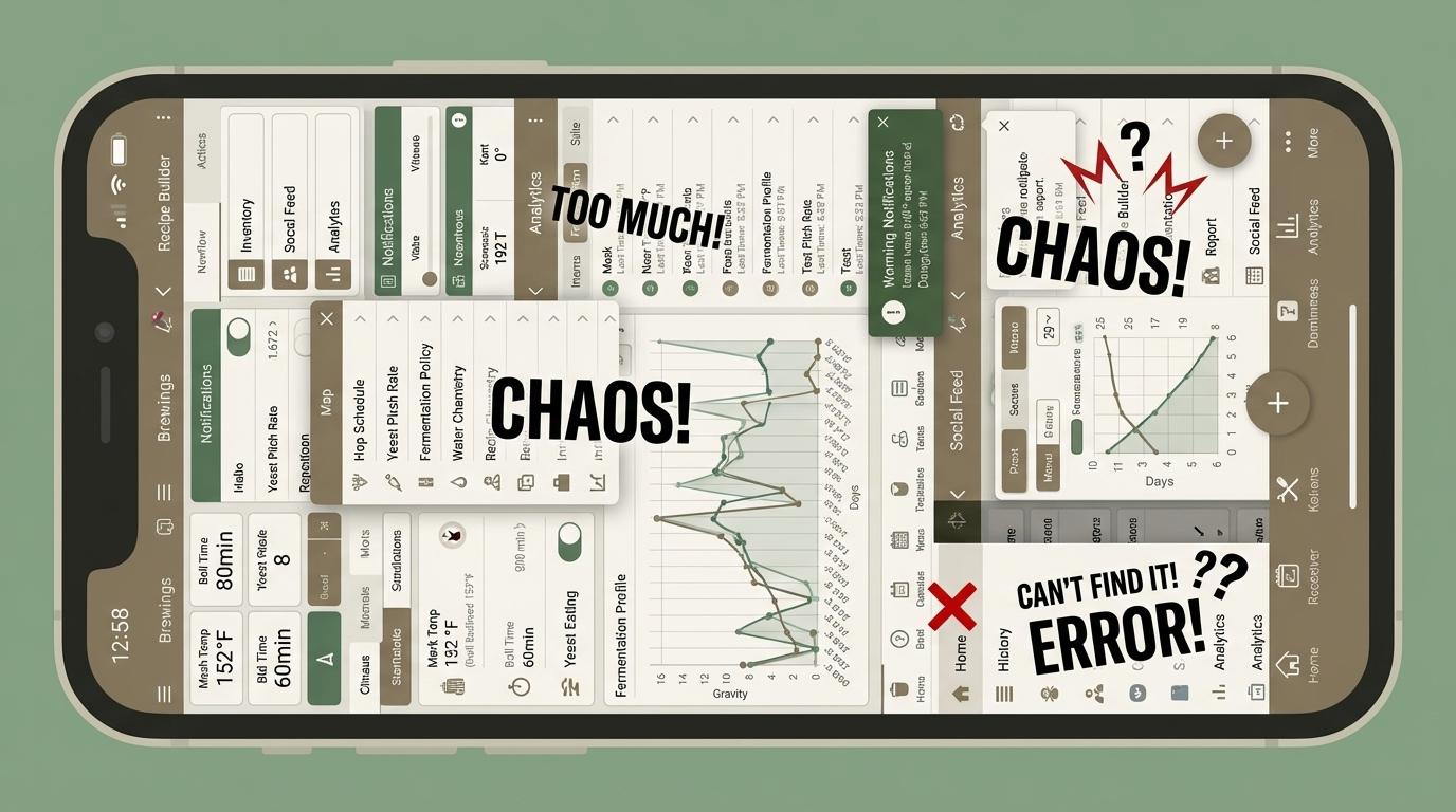
Most apps start simple. Then they grow. A feature gets added because one user asked for it. Then another. Then someone on the team has a "wouldn't it be cool if" moment, and suddenly you have a settings page with 40 options and a tutorial that takes 15 minutes to complete.
We've all been on the receiving end of this. You download an app to solve a simple problem, and the app asks you to create a profile, set preferences, connect accounts, watch a walkthrough, and accept three permission prompts before you can do the one thing you came for.
That's the complexity trap. And it happens because teams optimize for power users while forgetting about first-time users.
How 10 Minutes Changes Your Thinking
When you commit to the 10-minute rule, it forces you to make hard choices:
What's the core action? If your app does five things, what's the ONE thing a new user should do first? Everything else can wait.
What can you skip? Profile setup, preferences, tutorials. How much of that is actually needed before someone gets value? Usually less than you think.
What are your defaults? Good defaults mean users don't have to configure anything. Bad defaults mean they have to fix your assumptions before they can start.
For GravityPing, our fermentation tracking app, we obsessed over this. The flow is:
- Hit "Start Tracking" on the landing page
- Name your batch, pick your schedule
- Log your first gravity reading
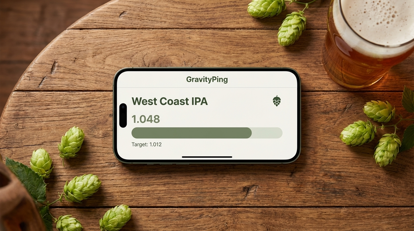
Total time: under 2 minutes. No account required. You don't even need to sign up to start using it. We built an anonymous-first flow so you can try the full app before deciding if it's worth creating an account.
That's not because we cut corners. It's because we spent a lot of time figuring out what we could remove without losing the core value.
Defaults Are a Design Decision
The biggest unlock for us was getting defaults right.
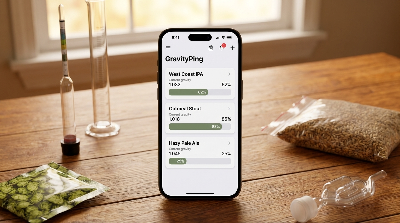
GravityPing's free tier includes daily readings with custom schedules. We made the defaults smart so it works out of the box, but users can adjust their check-in frequency whenever they want.
Users who want SMS or WhatsApp reminders can upgrade to Pro. But the free experience works out of the box, with zero configuration.
This is a deliberate design philosophy: the free tier should feel complete, not crippled. If your free tier feels like a demo, you've just made your product harder to try.
The Signup-to-Value Gap
We think about "time to value" as the gap between signing up and having a genuine "oh, this is useful" moment.
For a lot of apps, this gap is measured in days or weeks. You sign up, you poke around, you maybe come back next week, and eventually you either get it or you don't.
For SimbaApps products, we want that gap measured in minutes. Ideally single digits.
This isn't just about user experience. It's about respect. When someone gives your app a chance, they're giving you their time and attention. That's not free. The least you can do is give them something useful back, quickly.
Try It
If you're building something, try this exercise: time yourself going through your own signup flow as if you've never seen the product before. Start from the landing page. How long until you've done the core thing?
If it's more than 10 minutes, ask yourself what you can remove.
The answer is almost always "more than you think."
---
SimbaApps builds focused apps for niche markets. Our first app, GravityPing, helps homebrewers track fermentation with simple, well-timed reminders.